
We all know that the inserts drive the game, and many of them are so valuable that they can shut down the servers across all four apps. Star Wars has had a number of really cool sets, and I think its worth talking about some of my favorites so far. Remember, these arent necessarily the most valuable, just the ones I like the most.
1. Film Quotes
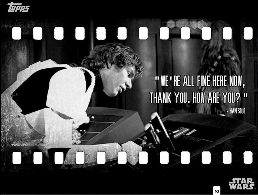
Star Wars has always been as much about the characters as it has been about the story or environment. Many of the quotes from the movie are among the most iconic in the history of cinema, which is why I love this set so much. Not only that, but it looks cool as a horizontal presentation with the film cell look to it.
2. Shred
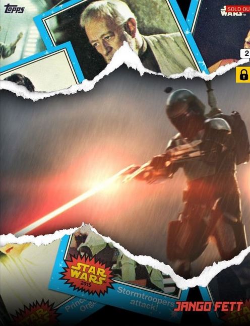
These cards are supposed to represent the feeling of opening up a real pack of cards, and I think they look really cool. The design easily accomplishes the theme they were going for, and the checklist has been awesome as well. I love the look of these cards.
3. Widevision
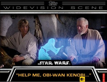
From a look and feel perspective, Widevision is the best of the weekly inserts in my opinion. It is a celebration of some of the best scenes in the movie series, and the movie theater like approach does many of these scenes the justice they deserve.
4. Vintage

Star Wars and Nostalgia go together like lightsabers and focusing crystals. Vintage is the embodiment of that nostalgia, wrapping the fun of the original film series in a set that commemorates some of the great moments. The bent corners and creases add that extra level of old age.
5. Bounty
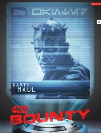
This is a really fun concept, and I am actually surprised they have found a way to stretch it as far as it has already gone. The “wanted” poster style look is quite impressive, with futuristic twist, something I was a fan of since the beginning. I just think its a cool way to showcase some of the universe’s biggest villains.


I’d say that the film quotes and widevisions are my favorites in terms of design. They both have their flaws though. I don’t like the font they chose for the film quotes, and generally, I don’t like the selection of the photos for widevision. Sure, “Help me, Obi-Wan” and “Duel of Fates” were both great selections, but the pictures for the “Yoda/Sirius” and “Not the Droids” feel incomplete (chopped off heads and such), and what’s up with “It’s a Trap”? That should be a film quote card, not a widevision. Why do you need a widevision shot of someone’s head? Weird, just weird.
I don’t care for the Shreds. Grievous is okay, but the design emphasizes the frame more than the picture. Obi-Wan is too dark, and most of the cards just don’t look right to me.
Some of the vintages are nice, but they generally are blurry, and the font and writing is horrible. I like the original Han, Tarken, X-wing, Victors, and Tusken, but garbage Han and most of the others just don’t look very good.
Bounty doesn’t do much for me.
As for me, I would put Galactic Moments in my top 3. I like the design a lot, and also like the info they provide.